tax.idaho.gov
Project Overview
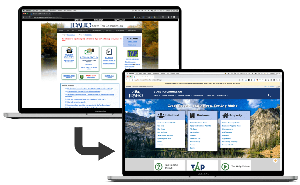
The State Tax Commission (ISTC) was in need of an updated, responsive WordPress website. The old website was built on Cold Fusion and needed to be migrated to a supported platform. The new website needed to follow the State website standards, meet all accessibility requirements, and provide the ISTC staff with easier ways to update and maintain the website.
My Contributions
Researcher, Designer, Project Manager, Developer, User-Testing
Timeframe
Research & Planning
In 2021, the Idaho State Tax Commission (ISTC) and the Idaho Information Technology Services (ITS) office reached out to Access Idaho to discuss our assistance in updating the ISTC website. ISTC was moving to WordPress and they previously had a webmaster start the project, but left the agency before completing it. The webmaster had done a lot of great work, which we took into consideration throughout our work on the project, but one thing that needed to be adjusted was the level of technical knowledge required to maintain and update the website. The agency did not plan to rehire the same level of technical knowledge the previous webmaster had, and from the beginning we understood that we would have to make some adjustments to ensure that the new website would not require php, html, css, or in-depth WordPress knowledge to update and maintain the pages.
I began by reviewing the WordPress site that was started, I conducted audits on the analytics, worked with the department to determine overall project goals based on their answers to the website design questionnaire ( see questionnaire). Once we had a good understand of what they were looking for in the new website, I began homepage mockups in Sketch.
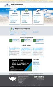
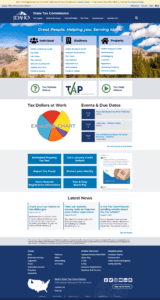
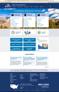
First, I presented them with 3 options for the homepage, as seen below, and from feedback we decided on the final homepage version (on the right).
After the homepage mockup, we moved to mobile and interior page mockups. From the WordPress site that was started, we liked the design for the sub-menu and the scroll spy menu on the right of longer pages. We discussed the best way to meet all of the goals for the new website with keeping the mobile-first goal in mind and in the end, created options that everyone was happy to move forward with.
ISTC also had heat maps from their old website we took into consideration. This combined with feedback about the difficulties searching for certain information, or information that resided on a lengthy webpage led us to decide to split up some of the longer pages into pages of their own and update heading levels and page content to be crawled easier by Google.
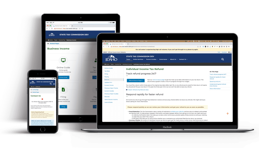
Development
A front end developer and myself handled the sub-theme development and migration of content. As a group, we decided on a more advanced search option that would allow users to filter results by the search category assigned to each page and document. A custom document management system was also built to replace a similar system the old Cold Fusion website utilized. The document management system allowed for many optimized pages, such as the forms pages, where the data tables display the forms that are added to the document manager and categorized as that specific form type. This helped to decrease maintenance and keeps the forms available to the public easily accessible.
To make the webpages simple to update and maintain for the less-technical website managers, the decision was made to create the pages in Elementor. The easy drag-and-drop editor with an accurate preview is easier than the block editor and custom html code that was included in the previous WordPress site that was started.
User Testing
As the website neared completion, I conducted remote user testing sessions on the new website. I worked with ISTC staff and the analytics to determine which tasks for the users to complete during the test. We made sure to focus on different personas, CPAs/businesses, general public, and the ISTC customer service team since they field the majority of the questions the agency receives from the public. They provided invaluable insight into different areas of the website, especially on the E-Pay page which we were testing 3 variations of to determine which was most popular.
